Thursday 23 May 2013

Building The Queens Building ....Scarily

First Group project at De Montfort and initially it was quite daunting: being thrown together with people you don't know that well to all work on the same outcome is a scary concept, But at the same time one I welcomed as I knew it'd be good practice for industry.
The whole thing turned out great though! I was put with a great group of guys (and one gal) who were really eager to get stuck in and every group meeting we;'d throw around some really solid idea's. We really liked the idea's of it being an abandoned school as well as 'Overgrown' being a recurring theme throughout so eventually we decided on those two elements to concentrate on. 


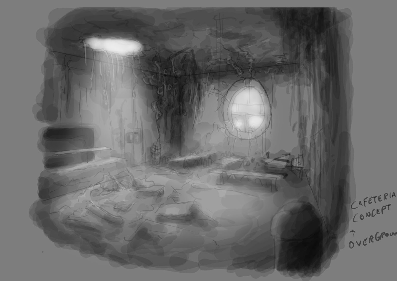
Early paint-over: Each one of us took load of reference photos of the Queens building itself, so we knew how it was constructed and the general layout. This is an early concept paint-over of one of the rooms i found in the building, an empty sound testing chamber. Thought it had a very eerie feel....  even though this would not make it into the final level. 

Concept Digi-Paint: After we had worked out how the work was going to be divided amongst the group, I ended up with the cafeteria/kitchen area of the building, and area we decided that the player was working towards reaching. This is a digital sketch I did after figuring out how I wanted the room to be laid out.... I had that freedom as the current day queens building doesn't have its won cafeteria (though it was in the original blueprints) so I could design it how I wanted, so long as it fit in with the style of the rest of the building. Liked the idea of having the ceiling partially collapsed  to show more deterioration as well as to let more light into the building. 

Assets: Though a lot of the assets I had to make for my area were quite basic, furniture, etc. I made sure to make as much relevance to the theme of primary school as possible.... hence the chicken bin above hahaha! (Some very atmospheric lighting going on there...and its not even in engine yet!)

One thing we had to be aware of, is that using UDK for out level meant having to research light maps so we could utilise them on all our assets. This was a steep learning curve for me as I had already made a lot of my assets at this point so had to go back through a lot of them so I could apply the maps.... a pain in the arse, but i got my head around it in the end. 

More Assets: Some of the basic stuff I made for my area; I was able to cut a lot of corners and save myself a lot of time for making several tile-able textures fro things like the equipment in the kitchen, as a lot of big kitchen surfaces use a polishes metal surface, so I was able to use this throughout a lot of my assets there.

Decals and Fun Stuff: Some of the last things I made for my level were posters... as my area was a cafeteria in a school I knew that making the sort of healthy eating posters would make it more authentic. It didn't take me long to design each one, but I think I managed to inject a little of my humour into each one ....well im proud of them anyway :D

In level: The final level really turned out great! everyone did a great job with their individual parts, and we pulled it all together to come out with a really creepy and atmospheric level at the end. I think our chosen theme of an abandoned and overgrown school gave our particular level a very distinct and unique feel to it, and in the end we came away with a project im proud to show off to people at every opportunity :)

Video Fly-Through


No comments:

Post a Comment