Thursday 23 May 2013

Personal Reflection of Second Year

Final Blog post of the year! 

YAAAAAAAAYYYYYYYYYYYYYYYYYYYYYYYYYYYYYYYYYYYYYYYYYYYYYYYY

Second year of University flown past already! Its crazy to think how fast the time has passed here, it seems even more so than the first year.
What really hits home now reaching the second year, is how much my mindset about the course has changed and resolved itself at this point. No longer am I stubborn in my annoyance of things and programs I find difficult to use... Now I just crack on with stuff, and focus on the things I need to learn that are relevant to ME and the direction I want to head in for my future career. I think that part of this is due to my sudden confidence in 3D work that i didn't have before.... since starting here its always seemed to overwhelm me, I've not really ever enjoyed doing it... it always seemed like once id finally learned something about it something else would pop up to undo all my hard work. Now however, I actually think about the stuff I know ill NEED and focus on that  Like at this point I'm pretty much set on becoming a Character artist... the fact that i got my first 'Good' grade really showed me that if i even end up in the games industry that's the only thing i know ill be happy doing. And I say 'if', because I know at the heart of it all ill always be more comfortable and happy working in 2D and so I've come to the conclusion that ill gladly take on a career as a general illustrator at the end of this course if that's what it takes to do something that I've always loved doing. I don't look at it like a 'plan B' or as a lesser option, but... games have always been something I've been passionate about and so has creating artwork.... but if i don't end up making artwork for games it wont be the end of my world :)

University has changed me a lot I think... college made me more confident with other people and my own work,  but in a way Starting over at Uni has kind of de-constructed all of that and made me stronger, both in my confidence, my work and where I'm going in the future. And i think that's what University's are ideal for... they put you into a path to your own future that your forced to mould yourself, without anyone else to hold your hand through it... you have to deal with the responsibility on your own and it makes you ready for the job you've always wanted. 

I think I've always put up with 'making do'; I found I was good at graphics so I stuck with that even though it wasn't necessarily a career I wanted to follow. But I'm hoping that at the end of my three years stint studying Game Art, I'll be able to achieve the things I want to do weather its in Game Art or otherwise, I want to be able to be able to go into work and everyday look forward to it with a passion. I think that's the most important thing, and i think that Universities are still capable of instilling that certainty in students who are unsure or who are just going by the motions. 

I definitely need the summer break to rest up from a years full of hard work, but I actually cant wait for the third year where I can finalise my time in education and step out into the real world. Its been 7 years coming, and I cannot wait :)

The Town With No Name :')

GAME REVIEW
I first came across this game when a friend of mine sent me the link of it from Youtube... and I literally was blown away at how this game even existed. I knew that I would never play this game, and i would never want to but what I was watching was thing of beauty at how horrific everything about it was. Anything that is so badly done in my opinion deserves a special place in my heart, and with that being said I've decided to share this magnificent gem of a game with the world via my blog. Enjoy :')


Overview


The basic premise of the game is this: You turn up in a rootin tootin wild west town for no other reason other that you can... though you'll find out exactly why if you watch it through until the end (now THAT'S a hook to keep watching). Your tasked with nothing else but to wander about this town that looks like its been made out of discarded shoe boxes aimlessly, vaguely interacting with the town's various deformed characters in some vain hope that you'll eventually get some sort of excitement or adventure out of this game. You wont.
You'll keep plodding along through this point-and-click excuse for a game more in awe of how bad it is, and laughing at that fact than at any point taking any of it seriously. I even think the producers were aware of how bad it was and at various points try to inject some sort of tongue in cheek humour into it... but most of it falls so badly short, or isn't relevant to anything that you will often find yourself paralysed by laughter for all the wrong reasons. 
Wandering about will then be suddenly cut short when you have to take part in a gun fight with one of the towns 5 billion apparent gun-slinger's, in a not-so tense test of your reactions as a cardboard cut-out darts about the screen trying to dodge your crap shooting.... though even if you miss it seems near impossible to care. You'll find the death scenes far more enjoyable anyway. There are a smattering of mini games in the Town With No Name, but they do nothing to improve the overall experience if nothing only get in the way of the hilarious characters that seem to be the only reason to keep playing/watching. if you manage to play this through to the end, you'll only wonder to ask yourself why, though the laughs you will get out of it make it worth the inevitable questions such a games existence seem to raise.

Gameplay

As a point and click adventure, that's exactly what you'll find yourself doing throughout your confusion with this game. The whole game is essentially one of those 'make your own ending' books, where clicking certain actions takes you on a different route than another... though this game still manages to confuse that amidst its randomness. Any action taken to interact with people or things, only seems to serve to show you where the next mis-timed joke is coming from... though it does inevitably shove you towards the games concluding story. If you could even call it that. 


The 'action' side of the game comes in the gun fights that seem to happen in between every other event, as your approached by a disembodied sheriffs hat informing you of the next person who wants to take a stormtrooper-like shot at you. Some of the decisions you'll find making just for the sake of seeing what happens as opposed to actually caring about the game progression... like stealing a horse for example, that's always good for a laugh. 

Story

A man with no name, steps off a train with no name into a town with no name, and hilarious misunderstandings occur. Also, events including having a bath so a prostitute will have sex with you for several months, catching a beer, watching Clint Eastwood smoke what can only be described as a tampon and shooting a child who calls you Shane can only be called the highlights, that lead to one of the games shock conclusions... yes.

Graphics

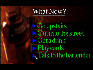
Errrrm..... ill let these screenshots answer that one


Lets just finish this up by saying, a LOT of MS Paint has been used, and even then not in a way that is remotely good... the only things that look remotely capable is where the artist has blatantly ripped off character's from westerns and the font from Back to The Future for reasons im still unaware of. 

Sound

Every thing heard in this game is an assault on the auditory senses, from the opening western tooting, the slam-dancing music that apparently greets you in every stable you walk into, to the voices... the voices of every inhabitant that gives you the impression that every culture from around the world has at some point moved here and inter bred with the locals... and even then its painfully obvious that its more likely than not just one guy attempting every stereotypical accent he can think of in some vain attempt at humour. And I still don't understand why sleeping with the prostitute is then represented by with what sounds like Marge Simpson singing a little ditty.

Conclusion

The best game you will never play. 
This is clearly what inspired Red Dead Redemption...


Clearly


Continuing To Draw Naked People In A Non-Pervy Way


Throughout this year my attention has become more and more focused on life drawing practice, as creating characters becomes my main objective for all future work. I've found that the continuation of life drawing this year had really helped me in becoming so much better, especially with the reduced time to do some of them in which has definitely improved the confidence of my strokes. You have to make each one count when you have only 10 seconds to draw!
At this point I've pretty much moved away from pencil completely, preferring inks paints and brush pens as all mediums in which I find myself stronger in. I find the permanence of such materials gives me a clarity when working, knowing that everything I press down on the paper its permanent, so I don't worry about correcting anything and just move onto the next piece. 
One thing i hadn't got much chance to explore this year is accurate use of colour: Its still an area im lacking experience in, and one im going to try and focus on practising in over summer ready for third year. 

Personal Practice: Watercolour still remains one of my favourite methods of shading, though I also love using coloured inks. I've been not only focusing on anatomy, but also more specifically portraits and focusing on faces. 


As we STILL haven't had a chance to draw male anatomy properly in class, due to a lack of male life models, I had to look up other resources online to practice in this area. As a character artist im going to need to know how to draw both men and women accurately, so this has been an important focus of mine. 


Digital Practice: I've also tried to broaden my horizons by practising life drawing in both digital and traditional media, to boost my confidence with the drawing tablet and Photoshop. These speed male studies I did I think show how I've progressed in terms of being able to capture the human form, as well as my shading techniques.

Yes, I Designed A Sci-Fi Strip Club

As a rule..... im not a fan of designing or drawing interiors. Even exteriors that much but I tolerate them more, due to having more space to play around with. So as you can imagine I was really looking forward to this project... hurhurhur.
However I thought of ways to make it enjoyable, and that revolved around being ridiculous and in something I knew would interest me enough to come up with some cool ideas.... So I came to the conclusion that I was going to design some sort of Sci-Fi Strip Club. Yes.
My main inspiration and thought behind this was... what if something like the original Star Wars movies featured a strip club in them? id imagine it something dingy but full of a wide variety of obscure aliens and species, like the Mos Eisley Cantina scene from A New Hope. 

Early Sketches: I looked at how i could create an authentic looking bar environment, that could till be identified as being something not of this world. I focused on fluid lines and curves for the bar area, but with visibly functional things like wise and tubes running in ceiling hatches to show the power supply of the building. 
Overhead Room Layout: I looked at things from a birds eye perspective so I could get furniture placement and overall idea for where things could go and how much room the bar would have. I went for a central bar with the tables kind of placed equidistant from that as if orbiting it: the rooms four corners are occupied by the dancing stages, two ate the back with poles the two at the front without. 
3D Block-outs: I decided the best way to bring my strip club to life would be to make a rough 3D model of it. This would allow me to place everything in the right positions as well have a basis for my final piece, with all the perspective and proportions of the club correct. 


Final Piece: I painted the final design by using a screenshot of my 3D block-outs, so that i had the rooms placement spot on. I made use of mood lighting a lot for the club, as i think that's what would give you the feel that this was a club not seen on this planet. Even though this was a project focusing on interior design, as a budding character artist I couldn't help populating my club with various weird and wonderful inhabitants! I think it gives the final things a much more atmospheric feel, as well as tell you what sort of establishment this is ;)

I also made this poster mock-up to advertise my establishment...
THE CLAMMY JAWA
All patrons of all species welcome! 


A Not So Masterful Masters Study

I initially had no idea we had to do a Master's Study... which is always a fantastic start. I was so busy in the middle of my group project that a lot of other stuff got pushed to one side, but once most of that was out of teh way i set a day aside to work on this. 
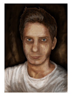
I decided on looking at Rembrandt, mostly because he's an artist that often pops up while researching other artists... that and the fact that I knew I wanted to do a self-portrait and his work focused a lot on that subject so I thought it'd be a good artist to focus on. 
The piece above is one I studied and used to compare to my progress a lot.... this stood out to me as most of Rembrandt s works are usually very stark in contrast between the shadows and sparse lighter areas, which he uses to great effect to highlight the areas and features on the face. I also like how this particular piece was very bold with its brush strokes that they became very apparent how each one was done: it was this approach I tried to adopt when making my own portrait. 

Progress Shot: This is the near finished version I painted digitally alongside a photo reference of myself. You can definitely tell its me, but the angle of the head is too straight on my piece as well as the head being slightly too narrow. My right eye is also a little off in its shape. 
 ~ Final Piece ~
I think overall, as a self portrait this painting is rather successful, but as a masters study it fell short quiet a lot from what i was trying to achieve. This being my first proper digital painting/masters study, it took me awhile just to adapt to treating the digital canvas like a traditional one and just paint with rough strokes to make up the much larger picture. I think I grasped a good understanding of how Rembrandt used his strokes to great effect, but by the time that realisation sunk in id pretty much finished... I think that this is definitely a piece I am going to revisit once I have more time on my hands, so that I can address the issues.

Building The Queens Building ....Scarily

First Group project at De Montfort and initially it was quite daunting: being thrown together with people you don't know that well to all work on the same outcome is a scary concept, But at the same time one I welcomed as I knew it'd be good practice for industry.
The whole thing turned out great though! I was put with a great group of guys (and one gal) who were really eager to get stuck in and every group meeting we;'d throw around some really solid idea's. We really liked the idea's of it being an abandoned school as well as 'Overgrown' being a recurring theme throughout so eventually we decided on those two elements to concentrate on. 


Early paint-over: Each one of us took load of reference photos of the Queens building itself, so we knew how it was constructed and the general layout. This is an early concept paint-over of one of the rooms i found in the building, an empty sound testing chamber. Thought it had a very eerie feel....  even though this would not make it into the final level. 

Concept Digi-Paint: After we had worked out how the work was going to be divided amongst the group, I ended up with the cafeteria/kitchen area of the building, and area we decided that the player was working towards reaching. This is a digital sketch I did after figuring out how I wanted the room to be laid out.... I had that freedom as the current day queens building doesn't have its won cafeteria (though it was in the original blueprints) so I could design it how I wanted, so long as it fit in with the style of the rest of the building. Liked the idea of having the ceiling partially collapsed  to show more deterioration as well as to let more light into the building. 

Assets: Though a lot of the assets I had to make for my area were quite basic, furniture, etc. I made sure to make as much relevance to the theme of primary school as possible.... hence the chicken bin above hahaha! (Some very atmospheric lighting going on there...and its not even in engine yet!)

One thing we had to be aware of, is that using UDK for out level meant having to research light maps so we could utilise them on all our assets. This was a steep learning curve for me as I had already made a lot of my assets at this point so had to go back through a lot of them so I could apply the maps.... a pain in the arse, but i got my head around it in the end. 

More Assets: Some of the basic stuff I made for my area; I was able to cut a lot of corners and save myself a lot of time for making several tile-able textures fro things like the equipment in the kitchen, as a lot of big kitchen surfaces use a polishes metal surface, so I was able to use this throughout a lot of my assets there.

Decals and Fun Stuff: Some of the last things I made for my level were posters... as my area was a cafeteria in a school I knew that making the sort of healthy eating posters would make it more authentic. It didn't take me long to design each one, but I think I managed to inject a little of my humour into each one ....well im proud of them anyway :D

In level: The final level really turned out great! everyone did a great job with their individual parts, and we pulled it all together to come out with a really creepy and atmospheric level at the end. I think our chosen theme of an abandoned and overgrown school gave our particular level a very distinct and unique feel to it, and in the end we came away with a project im proud to show off to people at every opportunity :)

Video Fly-Through


Wednesday 22 May 2013

Life Changing or Career Building?

The current climate In University's is getting tougher and tougher for students to get the most out of their time spent there, and the skills they need to progress on to the job they've been pursuing. With increasing amounts of avenues for people to take to learn skills and technical abilities for the job they want becoming available, as well as the increase in tuition fee's its easy to see why people would opt out of the higher education route. 
Especially in terms of the educational path to a job in the Game's Industry, there are more and more resources online, tutorials, etc.  that give you a comprehensive insight into the skills you need, and what tech and software you need to do it with. Also with the way that a lot of professional game companies are outsourcing to other specialist studios more and more makes it difficult to a fresh graduate to break into the industry, so the prospect of studying for 3 years to then struggle to even get in is daunting. 

I think for a games related course to stay up to date and provide the best for students is to combine the basic knowledge they need in any creative environment with up to date software and skills needed in industry.... This may go against what certain companies are after when they ask for creative abilities and being a good team player over actual qualifications, but that's  just it... every company will have their own attitude for hiring new talent, and its up to the student to be prepared with as much as possible to be able to adapt to any job opportunity thrown at them.

The main thing people need is a balance. A balance of both key traditional values, that are hard to be taught outside of a focused teaching environment and a teaching structure that focuses on up to date software being learnt as well as tasks set around those seen in industry to prepare people for the conditions for getting out there into the big bad world of work. I think Game Art here has got that pretty much in how they deal with things, though I think that the pressure of working in an educational environment that reproduces that of industry is definitely tough to work under, its effective at toughening you up to the right mindset so that we'll be ready for industry jobs. Though a lot of people that came here had come from foundation art courses and similar not everyone had an art background, like me: I came from 4 years doing graphic design, so I was never taught the basics of perspective and anatomy as much as I needed. But since coming here I've learnt A LOT of stuff that has been incredibly helpful, and in such a short space of time as well. University as a whole has equipped me mentally to be able to deal with things, and handle work professionally so I think it is still a key route that young people should take if they hope to progress into the job they want.


My planned celebratory dance for future job offers


Tuesday 14 May 2013

Moonshine....... Y'all

For this little assignment, we compiled together a list of various 'themes', 60's america, Mongolian steppe, ancient Greece, etc. .. all pretty as random as possible from each other. The end vote was for the theme of 1920's America, with the title of 'Moonshine'.... I'm not quite sure why, because I certainly didn't choose it. But never mind, despite being a subject I don't necessarily have an interest in, I dived into research and accepted it as a challenge. 

We had the choice what we would make for this project, environments, vehicles or characters. As a budding character artist, I went for that, looking into various types of folk seen under the category of 'Moonshine'... which was pretty much all Red-necks and Hill-billies. 
Even though I was concentrating on Character design, I also still looked at vehicles and environment and added them to my mood-board ... knowing what these sort of things looked like will no doubt help me when I create my final piece with my character in it. 

Early sketches I did relying on the reference gathered in the mood-board.... I was aiming to make a male character this time around, as the last character design project I did was a female, and I like to mix it up sooo... yeah. I want the character to be as stereotypically rural american as possible, without having to resort to every stereotype as possible... a careful balance is needed so you can tell who this type of person is instantly, and not be TOO ridiculous. 

I liked the idea of a scrawny old dude, who looks has a xylophone ribcage, and a constant slouch as if he has spinal deformities..... which he could well have. I liked the idea of giving the character a name, and as this fellah is clearly so beautiful I decided on the name 'Handsome Herb'... very suitable I think! Other things like a missing eye, lank hair that only covers the rear of his head and visible veins and liver spots all add to Herbs charm :D

This is the final character design..... which I think turned out not bad! I was especially happy with how the pose turned out, as it gives him that ungainly posture, that combined with his scowling, lopsided face give him a combination of threatening and comedic vibes. I made sure to add lots of little details to enhance his appearance as a red-neck without being as obvious as a cowboy hat and some straw in his mouth: Things like, visible under-arm hair (the first character I've EVER designed with that...it's such a proud moment), veins, dirty long nails, and plenty of filth and mud on his bottom half, where he walks about in the mud but refuses to bathe more than at least 2 times a year. One thing I was worried about with thus final, is that it was kind of starting to look a bit 'Wild West', and I didn't want it to be confused with that... the font used for his name in the above sheet kind of has that vibe to it, but i think the overall character design is kind of timeless in that respect, so I'm happy with that. 


This is the Final Piece I did of my Character of Handsome Herb in an environment. Obviously the focus of the project was to create something  that reflected the activities of the illegal Moonshine Creators of the 20's, so I showed Herb with his secret stash of buried Moonshine in the woods near his ranch, testing out a new batch he's concocted. I'm quite happy with the progression of my digital skills and I think it shows in this piece, with my use of shadows and lighting.... which is pretty much what the whole piece relies on, I decided against adding full colour, just because it took away from the atmospheric feel to it.