The feedback from my first assessment definitely helped in showing me which areas I need to improve in, though this post I will look at my work in improving my first two Blitz briefs that were both a re-introduction to 3d after the summer holidays and an introduction to implementing our 3d work into a games engine.
With the trash project, the only main issue with my final model was how I hadn't specified the detail on its normal maps.... making certain areas that should have been flat, look embossed on the items (like the printed font and logos on the boxes). I went back into my normal maps, and clone stamped areas that were bumpy, to become 'flat' so that they wouldn't end up looking with an embossed effect on the final object.
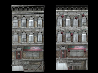
Another issue with my original construction, was that a lot of the geometry of the first and second floors was duplicated without me realising it, which in turn affected the surface values of the building maps (it made them all blurry and distorted to look at). So I went through each face of my buildings and deleted them until they didn't overlap any more.
This time round I decided to make use of tile-able textures, with some brick textures I took from my photo references to create my texture maps, editing them so they tiled. I made sure the bricks were more darker tones, and had a grimier surface property as my previous texture used seemed to bright and clean compared to the surrounding buildings
.
Even though I wanted to add a lot more external decoration and derelict things to the building, the time I had to work on this before I re-submitted it was limited... so with the time I had I decided to create some Chinese lanterns to go outside the old restaurant, which helped in adding to the exterior aesthetic to the building.

With the overlapping geometry sorted, the textures became a lot cleaner, and with the tile able textures applied, the tone of the building became more in tone with the others. I also shifted some of the window textures around, so they appeared less symmetrical, which I think was one of the last models problems. With the final thing, I checked all of the problems I originally had once i brought it all into UDK to see how my changed materials and textures looked in engine. The end result is considerably more polished than my first attempt, with the removal of the cloned geometry sorting out the texture surface problems, and the use of a tillable texture making the building look better, and also saving texture assets with the use of just a one texture. With more time, I would have liked to add more external props, such as statues, and maybe even create a visible interior through one of the buildings windows.


No comments:
Post a Comment