Friday, 25 January 2013

Feedback ~Visual Design

With my Visual design work, it was mostly a case of getting up to date with the work we had been set so far, which I managed catch up on over the Christmas holidays. Also, with a lot of the work I showed Chris, I had done it all traditionally so with any changes that could be made it was suggested that I do them digitally once I had them scanned in. This is the case with my Abbey Park final shown below:

Even though im not completely done editing it, here is how I've changed it so far: turned the contrast down slightly, by adding darker shades to the piece, mostly to the right corner as this is overly bright in my original painting and shows not much form underneath the light reflection. I've also tried to make more of an emphasis on the bridge centre piece as this is the focal point of my painting. 
This is one of the pieces I did of abbey park leading up to the final, and was my focus on using colour that I am concentrating on this year. It was suggested that to make the object of the bridge closest to the viewpoint, that I make a copy of my original painting and got over it with a fine line pen, to enhance the edges of the solid objects. 
A piece that I completed over Christmas, from the original pencilled line art, I am really pleased with how this came out. I think it is the most accurate use of colour and lighting in a painting I have done so far. The only thing that niggles me about it, is that the shapes of the circular components of the train are not completely accurate, as they were an area I struggled to get right. I will probably try to adjust the front of the train digitally, later on. 
With a lot of the work I did over Christmas, the Leicester sketches I did probably were the best at showing how far I've improved, as I did them in precision fine line pens and permanent media such as these are media in which I tend to do well in. This combined with a watercolour wash, is a technique in which I will focus on for future works, as the end result is one I am very satisfied with. 

These were preliminary sketches done with ink and brush pens for my Bradgate Park work: Probably the least successful pieces I've done so far. My intent was to try and do them as fast as possible, but with the media involved the brush strokes tended to be quite thick and so made it difficult to create definitions between the far and near objects. Probably too stylised from the original images they are trying to capture... still, I enjoyed using the different media. 

Initial sketches done for 'War of The Worlds' project, according to my tutor, the loose lines worked quite well on some of these sketches even though when approached with an open project like this I find it quite hard sometimes to be so loose flowing with my pencil strokes as my head full of ideas, gets in the way of just putting pencil to paper. 
A final painting for my 'War of The Worlds', depicting my 'tripod' design. As a rough painting, it still needs a lot of work and more details adding, which i will most likely do digitally later. 

Overall my visual design has greatly improved, and with more projects that involve freedom im finding that im getting into the flow more, as im having more fun at letting my imagination kick in. One thing that was noticeable was my lack of confidence in pencil, compared to my work with pens, so it was suggested i experiment with various mechanical pencils to try and get an ideal pencil to translate my strokes. I think the next step from here, is to approach painting digitally in the next project, as my work is still focused mainly on traditional, as im stubbornly stuck firmly in that area :p


Feedback ~Game Production

The feedback from my first assessment definitely helped in showing me which areas I need to improve in, though this post I will look at my work in improving my first two Blitz briefs that were both a re-introduction to 3d after the summer holidays and an introduction to implementing our 3d work into a games engine.


With the trash project, the only main issue with my final model was how I hadn't specified the detail on its normal maps.... making certain areas that should have been flat, look embossed on the items (like the printed font and logos on the boxes). I went back into my normal maps, and clone stamped areas that were bumpy, to become 'flat' so that they wouldn't end up looking with an embossed effect on the final object. 


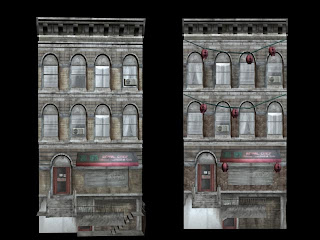
Another issue with my original construction, was that a lot of the geometry of the first and second floors was duplicated without me realising it, which in turn affected the surface values of the building maps (it made them all blurry and distorted to look at). So I went through each face of my buildings and deleted them until they didn't overlap any more. 


This time round I decided to make use of tile-able textures, with some brick textures I took from my photo references to create my texture maps, editing them so they tiled. I made sure the bricks were more darker tones, and had a grimier surface property as my previous texture used seemed to bright and clean compared to the surrounding buildings

Even though I wanted to add a lot more external decoration and derelict things to the building, the time I had to work on this before I re-submitted it was limited... so with the time I had I decided to create some Chinese lanterns to go outside the old restaurant, which helped in adding to the exterior aesthetic to the building. 


With the overlapping geometry sorted, the textures became a lot cleaner, and with the tile able textures applied, the tone of the building became more in tone with the others. I also shifted some of the window textures around, so they appeared less symmetrical, which I think was one of the last models problems. With the final thing, I checked all of the problems I originally had once i brought it all into UDK to see how my changed materials and textures looked in engine. The end result is considerably more polished than my first attempt, with the removal of the cloned geometry sorting out the texture surface problems, and the use of a tillable texture making the building look better, and also saving texture assets with the use of just a one texture. With more time, I would have liked to add more external props, such as statues, and maybe even create a visible interior through one of the buildings windows.   


Wednesday, 2 January 2013

Elements of Game Technology, part one: game engines


The 'game engine' is essentially, what makes a game work, it brings all the individual designs of characters, environments and throws them all together into a working world for people play. The use of game engine Editors allows us as game artists to take the artwork and 3d designs we create and apply them under game and playable conditions, and see how our concepts and ideas as games are ultimately adapted into a finished, interact able product. It allows us to apply our basic ideas as still objects to an interact able environment, where we can see our characters move about and our worlds come to life with lighting and weather conditions.
As the current stage of the course is how we adapt our creations to in-game engines, im going to look at a few examples of engine's used in the industry today.


UNREAL Engine
The most popular and widespread games engine used in the industry today, beginning in 1998 it has been constantly updated and developed to meet the demands of each generation of software since. It is its ability to adapt to varying platforms that has made it so popular and as the multi-format engine of choice amongst developers, both in smaller and more renowned game studios. It is its adaptability that has made it so popular, and has been utilised by multiple companies in a varying genre of games, from shoot-em-ups to sports simulators. It is this adaptability for use in many types of game genre that sets it apart from other engines, and makes it both invaluable and affordable for games developers in the current gen market.

Demo showcasing the new elemental effects utilised in UNREAL 4

CryENGINE
Fairly new on the scene compared to other engines, the CryENGINE has been incredibly impressive so far with revolutionary graphics and physics displayed in their shoot em ups, Far Cry and Crysis. The CryENGINE is notable that it was released while pc gamers were waiting for other big name pc releases, and so its release of such amazing looking games in the lull was what was needed for game developers to up their game and for Crytek to establish a name fro themselves. Though utilised in the FPS genre and its own games, the CryENGINE is being utilised more and more over other competitors, and the latest version, CryENGINE 3, is unique in that it is being developed with all current gen consoles in mind. Another advantage it has is that it handles all its own physics, animation and sound, without support from other third party developers, making it self reliant and have an advantage in an ever competitive field.

Demo showcasing the graphical power and physics of CryENGINE 3


RAGE Engine
Up until the current generation of consoles, Rockstar have always relied on other developers to supply their engine to power their brilliant run of games, such as GTA 3, Vice City, San Andreas and Bully (In the Form of Criterion's Renderware). It was with the high concept behind their sequel to red dead revolver that would lead them to developing their own in-house engine though, in the form of the Rockstar Advanced Games Engine. The RAGE Engine plays to the strengths to the games Rockstar specialise in, by being able to generate massively immersive streaming worlds, with smart A.I and weather effects thrown in for good measure. Its also notable for working incredibly well with other third-party engines, such as Euphoria which they have used to power their animations.

Demo of the world of Red Dead Redemption, brought to life by the RAGE Engine